Hey friends,
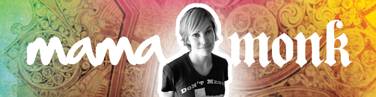
I’m working on the new header for our move over to Patheos and I need your thoughts on my two possible headers. Will you leave me a comment with your opinion? Which do you like the best?
or

PS Special thanks to my brother, Jason Boyett, for the design and to Erin Molloy Photography for the general awesomeness!


The second one
Love the second one!
The second one looks the best. :0)
Ditto to the 2nd one.
I like the second one - looks a little kinder and more accessible.
I like the second one!
I like the first one.
They’re both beautiful. I like the smiley one better. It seems more welcoming and warm.
The second one for sure!
Definitely #2
I haven’t ever commented
Before, am a fairly new reader, but I love your blog!!!
I like the second one much better-friendlier, prettier =0)
I like the second one. But both are lovely!
2nd one
sorry but I love # 1. like your thinking deep thoughts and looking toward home.
Hi Micha,
I like the second one. Congratulations on the new changes! I do love your blog and it makes me sad I didn’t make more of an effort to get to know you and Chris in SF!
Best,
Chelsea Hertlein
Thank you Chelsea. I’m so glad you’ve been reading the blog.
I too like the second one!
Is there any way he can make it a little less Beth Moore and a little more Anne Lamott? I like my theologians gruff and cantankerous. Obviously this is unhelpful.
Clearly Micha needs some dreads like Anne Lamott. Let’s start a petition.
Ha! Yes! What I meant was, Anne Lamott has attitude. Ain’t no one gonna dismiss her opinions. When she speaks, you sit up and you listen. The current Mama:Monk banner has that kind of spirit and flavor, and that’s what initially drew me to this blog.
Lyndsey, this cracked me up.
Ha! Me too. I’m sorry to say that in real life I’m a lot more Beth Moore and a lot less Anne Lamott.
The second one due to your smile and the font.
You’re gorgeous and I love both of them but my vote is for the second one. : ) <3
Thank you, sweet friend.
NOT #1. The hair is a bit too “Hanson” (sorry) and just not as compelling. #2 is WAAAAY better. It’s too bad you’re smiling so much in it; is it possible to have the same kind of pose but just look a bit more pensive so it goes with all your different kinds of posts (and not just the super-happy ones)?
HANSON???? I LOVE that. Davita, you just made me laugh hysterically.
i vote for the second one!
I like the second one, esp. the picture. However, would love to see the second picture with the first banner - because I especially like the wheat in the first one…. Thanks!
That’s why I love the first one too! Love that wheat (with the city in the background). But, I don’t have any smiling pics in front of that wheat…
Micha, I like the 2nd option the best. Your smile lights it up.
The second one is perfect! Love the picture and it’s more you I think at least! Xoxo
I like the second one (: Your smile is so sweet, I think the first one isn’t as welcoming and friendly.
Both lovely but second just looks like “you”!
The second one is best! More approachable - love the smile.
The second one!
Ha! I see you have lots of votes. I love the second one…that’s how you are when I think of you…smiling!
The second one is just lovely . . .
Second one. The wheat is pretty, but I find it distracting. Too much going on for me.
I also like how, in the 2nd one, the word “mama” is over the grey background and next to you, and the word “monk” is over the cross image. And yes, you have a beautiful, welcoming smile. This makes it feel as though reading about Benedictine practices in motherhood/regular life is approachable for anyone, not just super spiritual folks.
And finally, yay! Congrats again.
love the second one
Pissed reflective Micha vs Happy insightful Micha. Number 2 for sure!!!
Pissed reflective Micha! Ha! So happy to see you here, Cameron.
The first one is way better!! I love the colours in it.
Both beautiful! So excited for you.
Also, how did I never put it together that Jason Boyett was your brother?
You’ve obviously never noticed our annoying tweets about our family. I’m pretty sure the rest of the world rolls its eyes.
Thank you, Addie.
I like the second one best- but they are both lovely options!
Both are very nice, but the second is my favorite.
2nd one. In the first you look semi-sinister…which I never thought I would be writing about a Micha picture. xocaq
Semi-sinister Micha!!!!!
The first one!! You look contemplative and monkish!!
The second one is much fresher and inviting
I think the second one *looks* like a more official blog photo/header, but I like the first one best: your name beneath the cross, the title words complimentary and contrasting at the same time, thoughtful look… that’s my gut reaction. Both good.
Second one. I don’t mind whether you choose to look smiling or pensive, but being able to see your eyes helps a stranger-reader like me trust you.
The second one
Smiling > Pensive
I didnt read the other comments because I didnt want them to sway me. I love the second one the best.- my humble opinion.
You’re so sweet to not read the other opinions! You’re in the winning crowd, Anna…
Probably way too late, but I like number two.
Never too late. Thanks Kari!
#2~
smiley * though mostly i just like that 2nd layout better, so a more pensive look would work too! Congrats again!!!
Thanks to everybody! It’s so fun to see so many of you around here today. I’m thinking 2 is our winner…August totally agrees.
Well, looks like the second one’s a winner and that’s my choice too.
When I picture you as i read your words, I always picture you smiling.
Even when you are saying hard stuff. Or crying. You have a beautiful smile and the world shouldn’t miss out, especially if they have never seen it live and in person.
Micha, so cool all that is going on for you!!!! i”m loving catching your thoughts and look forward to reading your book! we miss u at good sam. on the voting front…I like the lettering of the first best; your name is more legible to those of us who are finding it hard to read and need the larger letters plus I really like the black letting of ” monk” and the cross slightly tilted. however the smiley face is so much better than the other, can you put your smiling face on the first layout? that would be the best choice in my opinion congrats on everything! love, dina
The second one! First is way too serious, not that monks are not serious, nor you at times, but it’s your sense of humor rising out of your deep spirituality that touches my heart!
The second one, please.
The monks I know are the happiest people I’ve about ever met. So I would vote for photo 2. Might be fun to see if you could put it into layout number one, though I think both backgrounds are great. Pretty cool to have a brother who can do such good work for you.
You look a little bit younger in the first one. That’s my shallow contribution, sorry…!
Better that than never - love the second one!
I like the second one best- it’s easier to read.
#2 is best! Definitely!!
The second one
The second one is just “you” - love it!
Pingback: An update on the move to Patheos | mama:monk
Pingback: An update on the move to Patheos | mama:monk